The flat design revolution has continued to gain momentum since it was introduced to the Windows Phone platform in 2010. It’s not hard to see why: an interface with this design seems more intuitive, well-suited for responsive elements, modern frameworks, and looks attractive when done well.
Flat design began to exist as a counterpoint to the ubiquitous skeuomorphic style, but has since become much more than just "Option B".
Initially, flat was exclusively two-dimensional with a total focus on minimalism. Modern flat 2.o uses shadows, gradients and other elements that make it "almost flat".
5 characteristic components of modern flat design:
1. Long shadows
Long shadows add depth and dimension to images without having to sacrifice the minimalistic icon details that make the interface attractive. 
2. Dynamic colors
Complementing sparse visuals is simple with vibrant colors, especially lighter shades.
Different color backgrounds in contrast with the base color of the elements make the page with a "tiled" menu more lively.
The Flat UI Colors website contains the most effective color patterns for flat. 
3. Simple typography
The choice of a font in flat is driven by one criterion: readability. Commonly used sans-serif fonts have a constant stroke width. 
4. Transparent button
One of the trending elements in modern web design. The reason is that it does not attract too much attention, but is clearly recognizable as a button. 
5. Minimalism
Flat and minimalism go hand in hand, using the same principles: simplicity and content focus.
It may seem that the use of flat design is a universal solution, but minimalism is difficult to implement: the fewer work elements, the more attention they require.
As great as flat design may seem, there is no guarantee that it will work for your site. Check out its main advantages to understand whether it is worth planning a global redesign.
Advantages:
used in the adaptive interface;
simplifies navigation for the user;
clear structure and schematic visuals emphasize the internal logic of the page;
fast page loading, due to the simplicity of graphics;
familiar typography enhances readability.
Flat design is all about simplicity and minimalism, which on the other hand makes it difficult to communicate visually complex messages. Therefore, before throwing headlong into simplifying the interface, you should carefully consider the scheme of interaction between the site and the user.
Based on Web design book of trends.
Who develops mobile apps and websites, wrote a column for us and put everything in its place in relation to flat and material design.
By and large, the difference between flat design (Flat design) and material design (Material Design) is subtle. To a person who does not have a deep knowledge of graphic design, they really can seem very similar. In this article, I'll try to shed some light on some of the differences between them. You will gain additional knowledge, which is so necessary so as not to accidentally hurt the delicate nature of the designer.
A bit of history
Before we start talking about the differences between the two most popular design trends, let's find out where they come from. There is an opinion that material design is created on the basis of flat. Where did flat design come from then?
Skeuomorphism
When it comes to user interface and web design, the concept of skeuomorphism refers to an approach whose main idea is imitation. Without going into too much detail, let's just remember Apple's interfaces before iOS 7 with their "realistic textures, lighting, and pretentious effects."
The attempt to make digital objects look like their real world counterparts was justified by the need to facilitate user interaction with the device. As a matter of fact, it is for this reason that all interfaces with realistic textures have dominated the digital world for many years. The skeuomorphic design did a great job of helping users seamlessly transition from the real world to the digital world.
However, with the rise of mobile technology, it is gradually becoming necessary to focus primarily on convenience and ease of use. Agree, in this area, the need to create mobile solutions accessible from different devices is growing exponentially. At this very moment, simplicity becomes the new design standard.
Note: By no means think that skeuomorphism has completely disappeared. It is widely used in games where it is necessary to create a realistic world and help the players feel their character in order to immerse themselves in the game process.

flat design
This style is completely devoid of any three-dimensional objects. Roughly speaking, in flat design there are no such stylistic elements as a drop shadow, textures, gradients, but attention is paid to the play of fonts and colors and icons. But why was all this necessary? The answer is simple.
First, flat design significantly reduces page load time. The absence of “heavy” skeuomorphic details (just imagine: layers, serifs, gradients) makes flat design elements “lighter”, which in turn significantly speeds up loading times. What's more, flat elements look equally appealing on both high- and low-resolution screens.
Secondly, simple images can convey your idea to users faster than detailed illustrations: they are sketchy and therefore quite easy to understand.
And, of course, flat icons with a relatively simple font can direct users' attention to really important content.
Today, flat design has received well-deserved recognition, but still it has not been without problems. The most obvious example of such problems was the release of Windows 8 by Microsoft. This operating system is considered a pioneer of flat design and supports the Metro design concept. What led to problems was that the company found it necessary to pay more attention to the typography than to the actual graphics.

The results of the Windows 8 usability test, conducted by the NN Group, showed that users had difficulty distinguishing clickable objects from non-clickable ones. Users have complained that objects that look static are actually clickable. As a result, the company's main mission - to help users correctly interpret the system - failed.
Another company that is often associated with flat design is Apple. They moved away from skeuomorphic design elements in the mobile operating system iOS 7, released in 2013. This time around, the transition was received a little better, mostly because the company didn't try to completely revamp the UI concept, but just added a few changes towards flat design. This gave users the opportunity to use the product, relying on their previous experience with operating systems and websites.

material design
Let's be clear right now: material design is more of a branded product than a spontaneous design trend that has gained wide acceptance. This is what basically distinguishes it from flat design.
By calling material design “signature”, I mean that it has a whole set of clearly defined recommendations and principles that every self-respecting designer follows. It is quite obvious why Google introduced its Material Design: there was a need to unify the design so that applications look the same on any of the many Android devices.
Although quite functional, flat design is still considered difficult to understand. The truth is that flat objects on the screen can confuse users (especially those who are not experienced with mobile and web interfaces). Therefore, material design tries to bring back the elements of skeuomorphism, but in a greatly simplified form. The images look flat, especially when it comes to colors, but are still multi-dimensional thanks to the presence of the z-axis.

In other words, material design can be called an improved version of flat design with elements of skeuomorphism - animation, shadows and layers. In this way, you can make the product more intuitive in terms of navigation, and avoid unnecessary complexity in terms of style in general.
Advantages and disadvantages of flat design
Let's leave behind the history of the evolution of styles and move on to something more significant - list the strengths and weaknesses of flat design.
- Minimalism and style
- Intuitiveness. It will be easier for you to convey your idea to users.
- Saving time and resources. Pages load much faster with less bandwidth consumption.
- Focus on content. An interface without unnecessary details that can distract from really valuable information.
- It looks equally good on various devices, whether it is a PC or smartphone browser.
- Speeds up the design process of a website or application by getting rid of unnecessary design touches.
- Minimalistic style.
- Fairly intuitive. Material design will be equally easy for experienced users and beginners to understand.
- Moderate skeuomorphism. Everything looks more realistic thanks to the use of the Z-axis (Google's unique concept).
- There is a set of manuals that are constantly updated. Therefore, any designer can always turn to them if there are difficulties in the process of work.
- Animation for web solutions is encouraged. There is no need to remind you how much people love movement. In addition, animation allows you to make the interface more understandable and intuitive.
- Has an owner (Google). Therefore, any questions and suggestions for improvement should be addressed to the owner.
- Due to the presence of the Z axis, the design process may take longer.
- Animated elements require more resources.
- Strict adherence to guidelines can limit the originality of a design.
Summarize
In fact, one of the design approaches under consideration should not be considered to have a clear advantage over the other, since flat and material styles go side by side. They are both insanely popular and both are devoid of excessive realism. Material design is the successor to flat, while flat design itself was a reaction to too heavy and realistic solutions. Material design added something that flat design has always tried to move away from - a bit of skeuomorphism. Although one thing will always differ between these approaches: material design is a patented product of Google, and flat design is the result of a fusion of several design practices that strives primarily for overall simplicity.
In truth, flat design has evolved a lot in recent years, from a completely “flat” style to a “semi-flat” one. It now allows for the use of layers and subtle shadows to make objects look deeper than they previously seemed. So, we are happy contemporaries of flat design 2.0.
Lastly, nothing forbids you to try to combine these two approaches to create a truly functional and user friendly product. So get inspired by the flat and material design gurus and get to work!
If you find a typo - highlight it and press Ctrl + Enter! To contact us, you can use .
Flat design sites look like a simple geometric block space with color accents (icons, highlights in text, infographics) with a minimum of graphic details and no excess of textual information. As they say, "minimalism" and nothing more.
How not to draw flat icons
"Flat" website design came into vogue along with the interfaces of the new Windows. The growth in popularity of this style in Russia was facilitated by an increase in the number of self-taught web designers who do not know that the interface of a website and the “finger” interface (smartphones) are not the same (it is easy to scroll down the page with your finger - and, on the contrary, it will take a lot of patience and real interest to turn the mouse wheel down 3-4 screens). On Russian flat sites, you can often find such icons:
The example just takes bright colors that do not match with each other + bad quality icons (I took from a paid set as an example, but freelancers almost always use free downloaded icons from different sets, which also do not match with each other).
Behind the inability to draw high-quality graphics, novice designers easily grab the opportunity to simplify everything. At the same time, it is overlooked that the design in the style of "minimalism" implies a high-quality study of interface details, and not just the placement of icons downloaded from the Internet on colored squares in the style of Windows 8 (which can now be found on many supposedly "modern landing pages").
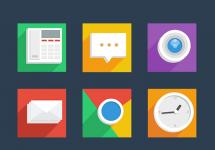
An example of good flat icons:
Colors and icons should be combined not only with each other, but also form a single whole.
Problems of low-quality flat design
1. Navigation and usability
The web is NOT a real space, so in order to create a sense of reality and understand your location, the sites use breadcrumbs, and icon pictures are close to real objects for quick understanding and ease of navigation. So, by the icon of the house it is immediately clear that this is “home”, by the icon of the handset - that this is a phone, by the basket - that this is a basket (as in a supermarket - everything is clear and simple), the icon with the image of a gift is a gift, etc. .
However, newbie flat designers often oversimplify pictograms. And the further designers are from intuitive images, the more difficult it is for the user to interpret them later. Oversimplification sometimes makes navigation difficult. As soon as everyone rushed to make fashionable flat website design, trying to imitate European designers, the simple rules of usability were forgotten.
2. Long flat footcloth sites
The pages stretched down 3-4 screens, while the space is used not only not economically, but on the contrary, an excessive amount of “air” is added. At the same time, there is no visual motivation for scrolling - no chips, no animation. How the developers planned to interest visitors to scroll down the page is not clear. After all, compared to sites where everything is compact, footcloth sites require a lot of energy to move the mouse around the screen and scroll.
3. Incomprehensible buttons
On flat sites, active elements are no longer obvious. With the advent of flat design, buttons have also become flat. But the visual image of the button came from a real physical button, and the shadows and gradients just show that "you can definitely click here."
4. Poorly drawn icons
Due to the hacky work of designers, icons on websites (this is especially noticeable on websites in the flat style) have lost their predictable images. Either due to limited budgets for design, or because of the failure of the web designers themselves, but the navigation elements on the sites often do not correspond to the primary associations and are “far-fetched”.
I suppose that the work on the creation of icons goes something like this: according to the TOR, the icon “Individual approach to clients” is needed. Personally, I have an image of a manager and two clients, each of which has an arrow of its own color (a blue arrow to a blue client, a red arrow to a red client). If a designer doesn’t know how to draw, he will look for an icon in ready-made sets (at best, he will buy it from a photo bank, at worst, he will download it from the Internet) and use the one that most suits the meaning. Most likely, it will be an icon of a man with a tie or a suitcase. In general, he didn’t go very far, but still in the design of the site it will be clear that the suitcase for “Individual approach to everyone” and the Watch for “10 years on the market” (by the way, I really saw it!) - the designer cheated.
5. False content orientation
Flat website design is content-oriented. Well, obviously - if the emphasis is not on graphics - then on information. But if you carefully look at the “modern” flat-style landing pages offered by Russian web studios, then little attention is paid to the content. Namely:
- The text is presented in any way. It is not clear how the accents are placed in it, what to catch on, and what is secondary.
- There is no design as such. Tables, bulleted lists, headings, announcements - often not worked out at all.
- Often bare text. There are no pictures and icons that visually reinforce the text blocks. As a result, the emphasis is neither on graphics nor on text, but on the “style” itself. In this case, the company with its proposals are lost.
So do you really need flat design for websites?
With the design of interfaces for smartphones, everything is clear - light, unloaded, easy to use. But with the design of websites in the flat style, I personally have a fat question - is it effective at all?
Most of the Customers do not understand the quality of graphics and, when approving the design of the site, they are guided by their personal taste (like / dislike). And here fashion plays a role.
A flat website design can be cool. BUT! A cool design implies a really high-quality study of usability and graphic elements, as well as the presence of creative features and effects. And if they are absent in the design, if there is no originality in the sites, they look monotonous, empty and boring. In general, what is now in most Russian sites.
An example of a quality flat design:
The fashion for flat website design is temporary, like any other fashion. Someone creates original, creative designs, and someone copies them and imitates them in style, because they do not know how to invent themselves. And, like mushrooms, cheap “fashion” sites are growing ...
In this article I will tell you about flat design. You must have heard something about this already, since flat has become one of the leading trends on the web over the past few years.
Today we will understand what flat design is, how it comes about and what you need to create a clean, bright and responsive design.
You can find good examples of flat design at http://market.envato.com/. There are plenty of layouts, icons and templates to give you a clear idea of what modern design looks like. .
1. What is flat design?
Flat design is a modern style of user interface, as well as graphic design, characterized by minimalism. Flat design is characterized by the use of a minimum of elements and the absence of various effects of texture, shadow and light, for example: mixed colors, gradients, highlights, and so on.
Flat versus skeuomorphism( Skeuomorphism is a design principle when one product is given the appearance of another, i.e. when various interface elements are copied from real objects - approx. translation.) , as well as rich design. However, it is worth saying that flat design is not at all as simple as it seems at first glance. It includes some features of skeuomorphism, but we will talk about this a little later.
In general, flat helps keep the user focused on the content without being distracted by the visuals. The flat design emphasizes the simplicity of the elements while making the interface more responsive, pleasant and easy to use.
2. A bit of history
Flat design, as you know, existed long before the moment when it became a global trend on the web. Flat design was quite popular in the 80s due to the fact that the technique at that time was not yet developed enough to support complex effects, textures and shadows. However, even then, the design strove for skephomorphism, trying to make interface elements as realistic as possible.
Flat-design, in the form in which we see it now, began to gain popularity after Microsoft began to produce products in the so-called metro-style. Metro is a UI design from Microsoft that impresses with its style and simplicity.
In 2010 Microsoft released Windows Phone 7, which used a flat design with sharp edges and simple graphics inherited from one of its early products. Microsoft (Zune). Later, inspired by the success, Microsoft released the Windows 8 operating system based on the same flat Metro style.
After all, flat design reached its peak in 2013 when Apple released iOS 7, showing a brand new design with completely redesigned user interface elements, including icons and fonts. Apple created visual principles of UI and icon design .

Shortly thereafter, Google also began using the flat style in their apps and web pages, calling it material design. Google even has an entire section dedicated to this style, including a description of the goals of web design, its principles, and instructions for creating various design objects: icons, layouts, and so on.

Since that time, flat has become a key trend in web design, making websites, applications and interface elements elegant, clean and stylish.
Thus, there are three global examples of flat design from firms, without which it is difficult to imagine the modern world of technology:
Microsoft's Metro design
Apple iOS 7 design
Google's Material Design
3. Remember cleanliness
Flat design is apparently called "flat" due to the lack of 3D elements and realistic effects such as gradients, textures, highlights, midtones, shadows. Remember, flat style is a two-dimensional (flat) way of depicting objects.
Moreover, in flat design, objects are depicted in a very simplified and stylized way.
And sometimes even just a silhouette or contours of an object is used, i.e. just enough to make the object recognizable, but not to overload it with minor details.

Minimalism has become a global trend these days: the simplicity of shapes and the use of sharp edges create a clean and pleasing design. Simple forms are more understandable and easier to understand. This keeps the design minimalistic, clean, and prevents it from getting a busy, messy look.
4. Perfect
Know that when it comes to creating flat icons and UI elements, you have to make them look crisp, neat and pixel perfect, i.e. as much as possible. Moreover, this applies to both raster and vector graphics.
With Adobe Photoshop, everything is clear here: it works with raster graphics, which are based on pixels.

As for the Adobe Illustrator program, it uses vector graphics consisting of curves and lines, called vectors, which are given by mathematical formulas.
Once upon a time, Adobe Illustrator was not a particularly convenient program for creating pixel-perfect graphics. The good news is that the latest versions of Illustrator have become a great tool for creating good graphics.
I must say that vector graphics mostly involve working with simple, flat shapes, solid colors and grids. Adobe Illustrator is very flexible and allows you to adapt the grid to your needs, align objects and use different types of snapping. This makes it easier to create the perfect design that looks clean and stylish on any display. If you want to learn how to create perfect graphics, then you should read the article: How to create pixel perfect artwork using Adobe Illustrator .

5. Color
One of the more specific features of flat design, aside from shadows, is the use of color. Most of the colors that flat design uses in their elements consist of just a few basic colors.
Color in flat design is distinguished by brightness, saturation, juiciness.The flat color scheme is not limited to a few special colors. They contain many shades, and their choice depends only on what you are depicting, whether they are icons of sweets or retro-style objects in a sophisticated retro palette.

Let's say you're a user interface designer and you're good with color palettes, and you're experimenting with the color bar in Photoshop and Illustrator, mixing colors however you like. However, this process is quite complicated and requires good intuition, experience and skills. Here you will find some tools that can help you create your own color palette.
Some of them are suitable for all kinds of designs and illustrations, not just flat designs. For example, Adobe Color CC, better known as Cooler. Today there is access to it, both through the website and directly through Adobe products. The cooler is a very flexible tool that allows you to either create your own color palette or choose from custom palettes from the library.
Another simple and handy color palette generator is Coolors. Just press the spacebar and the program will generate a color palette, you can adjust the colors, there is also an export function.
There are several other similar services with custom palettes that can be useful. However, there is one tool made specifically for flat design. FlatUIColors.com by Designmodo is a service with a set of “flat” colors, very convenient to work with. This site has become very popular with designers looking for good color choices for perfect designs. Try it!
And you can find more variety of colors and palettes in Google's Material Design Guide.
6. Long shadows
As mentioned above, flat design is characterized by simplicity, a lot of free space - this is why flat rejects the use of any effects. However, there is one effect that is specific to flat design. This effect has become a trend and a characteristic feature of the flat.
We are now talking about long shadows. They have some typical characteristics that make this effect recognizable, namely: a 45-degree slope and a large size (the shadow can be several times longer than the subject itself. As a result, long shadows give the flat some effect of depth.

This effect makes the object more three-dimensional, but at the same time leaving it in the context of a flat design.
7. Working with fonts
Typography plays a big role in flat design. Often the text becomes the main element of the composition.
Flat usually uses simple font styles that make the whole design clean and readable. You can find many free fonts in Adobe Typekit if you use Adobe products. You can also find many good free fonts on Font Squirrel. But don't forget to read the license if you're going to use the font for commercial purposes.
Most often in flat design, it is customary to use upper case and contrasting colors, this makes the text more legible.

Use fonts with care, remembering that it should emphasize and fit the design, and not look like a separate element. This does not mean that you cannot use serif fonts or cursive complex fonts. Just remember to be minimalistic and keep everything in balance. However, flat still uses sans-serif fonts more often, as they look more strict and neat.
8. Pros and Cons of Flat Design
Even though flat design has become so popular due to its many advantages, there are still some disadvantages that designers face when using this style. Let's look at the pros and cons.

pros
Popularity
Flat design has become a trend, gaining more and more positive feedback from designers and web designers, and it does not seem to be losing ground at all. On the contrary, it is spreading more and more, acquiring some new forms and features, becoming more and more creative.
Simplicity
The flat design is simple, minimalistic and clean. Flat on the web helps users focus on content rather than being distracted by visuals. This also works for mobile app interfaces: a clean design with large buttons makes for a perfect mobile experience.
Brightness
Color is another cool plus in flat design. Bright and saturated colors look attractive and clean, and the lack of gradients makes the design stylish. Moreover, such pure colors make it more positive, presentable, flat design creates the right mood.
Flaws
Flat has many more advantages, but no design is perfect, and we cannot idealize it. Here are some disadvantages of flat design that we have to mention:
Unresponsiveness
Sometimes the lack of important details or visual effects makes the process of creating a user-friendly interface difficult, and this generally makes the whole design unresponsive. Not all flat users feel comfortable, because it can be difficult to find elements on a web page that you have to click on or tap on the screen of a mobile phone, because they are not interactive.
Problems with typography
As mentioned earlier, not every font can suit flat design. Sometimes such a rich font with sharp edges looks really balanced and stylish. However, in the event that the font is chosen incorrectly, this can destroy the entire design. You have to have a really good feel for which fonts are suitable for flat and which are not. Lack of experience makes choosing a font very difficult.
Weak visuals
Due to limitations in the use of effects, colors and fonts, flat may look too simple and cold. Its minimalism can also be its main drawback - other flat designs end up looking exactly like yours. So it's very difficult to make your icons or web pages look different from someone else's design because you're using the same simplified shapes, limited color palettes, and similar fonts. As a result, flat design can become boring over time.
9. Future Flat Design Trends
It cannot be said that flat design is fully formed and stopped in its own way. Maybe it is because of its shortcomings mentioned above, flat tends to develop and change, acquire new features and enhance visual expressiveness.
If you look carefully at the last example of flat design, you can see that it really isgradually from his rigorous tools and begins to add subtle effects such as gradients, shadows, lighting and other visual effects.

These little touches give flat designs some depth without being overly detailed like skeuomorphic designs do. These minor improvements make flat more responsive and comfortable, as well as bring a fresh look, making flat more flexible and versatile.
Thus, flat does not lose its features, but becomes more interesting, flexible- He's really getting better.
conclusions
Thus, we discussed some facts from the history of flat design, and talked about colors, shapes and typography. We looked at different points of view, dwelled on the advantages and disadvantages of flat, and learned some of the main principles for creating good design.
I hope you have learned something new from this article, or at least found it interesting. You should try flat design if you haven't done it before.
After all, what else should be mentioned about flat design?
If you really like flat with its sharp edges, rich colors and crisp fonts, its cleanliness and minimalism, then go for it!
It's on trend, but as with any other graphic style, don't limit yourself to one technique. If flat is in trend, this does not mean that you cannot use other styles in your project. Skeuomorphism with its tiny details and textures can also be a good solution. Most importantly, remember that the design is different for each project, it must express its spirit, purpose, essence, while remaining convenient and functional. Forward!
Flat design has become popular in recent years for apps and websites. This is not to say that absolutely everyone likes this style, but it is definitely not suitable for all applications and sites. If there are many advantages of a flat design, such as simplicity and minimalism, making it easy to use. For some applications, flat design may be too simple. That is, it is worth adding some shadows or gradients to make it look better.
Many argue that flat web design is effective design. They say this is a way to make the project as user-friendly as possible. Here are some inspiring examples of flat design flat projects. This compilation of various portfolios is great for understanding flat designs that really work.


The ISSLand

January Creative

Minimal Monkey


What is flat design?
- Flat design focused on the user
- Flat design is simple
- Flat design - fewer gradients
- Flat design includes straight lines and square corners.
- Usually use strong color contrast
- Flat design has no shadows, bevels, textures or anything that looks 3D
- Flat design only exists in 2 dimensions
- Flat design is a trend towards simplicity and minimalism
- Flat design - do not use additional effects
- There are no extras
- Flat design - fewer buttons and "body kits"
- Flat design means focus on fonts
- Color combinations, contrasting colors, and interesting color variations are important elements of flat design.
- Flat design is one of many designs. It works for some projects and not for others.
What is not flat design
- Flat design is not skeuomorphism or design that emulates the shape and contours of "reality".
- Flat design does not include shiny buttons
- Flat design does not include decorations
- You won't find traditional ideas about "depth" in flat design.
- Flat design doesn't suit all projects
Is flat design just an efficient design?
Some consider flat design in itself to be an effective design. That is, it simplifies the use of sites and applications, allows you to find the necessary information without being distracted. Of course, flat design is not the only one that makes finding information easier. If everything is done well, then users will not have problems. The project should be simple and easy for those who are able to use it. Someone prefers to use flat design, and someone else design style.
Elements for flat design
Like flat design? Here are a few elements that can be used for a "flat" project
Flat Icon Pack